Agency & Client
Allan Chan
Gotthewanderingeye
Role
Creative Direction
Art Direction
Photography Art Direction
Design
Photography
Retouching
Scope
Brand Strategy
Brand Identity
Brand Name & Tagline
Stationery Design
Photography
Website Design
Where
photography
art & travel
collide.
I started Gotthewanderingeye due to my passion for all things photography, art & travel, and this is where these worlds collide. Drawing great inspiration from my artistic style to create my imagery, my photography is about the sense of escape. Wandering across the globe in pursuit of capturing captivating images that make beautiful art pieces for the home.
The name and brand Gotthewanderingeye is all about a life of adventure, and forever seeking beauty in our surroundings, through travel, portrait and landscape photography.
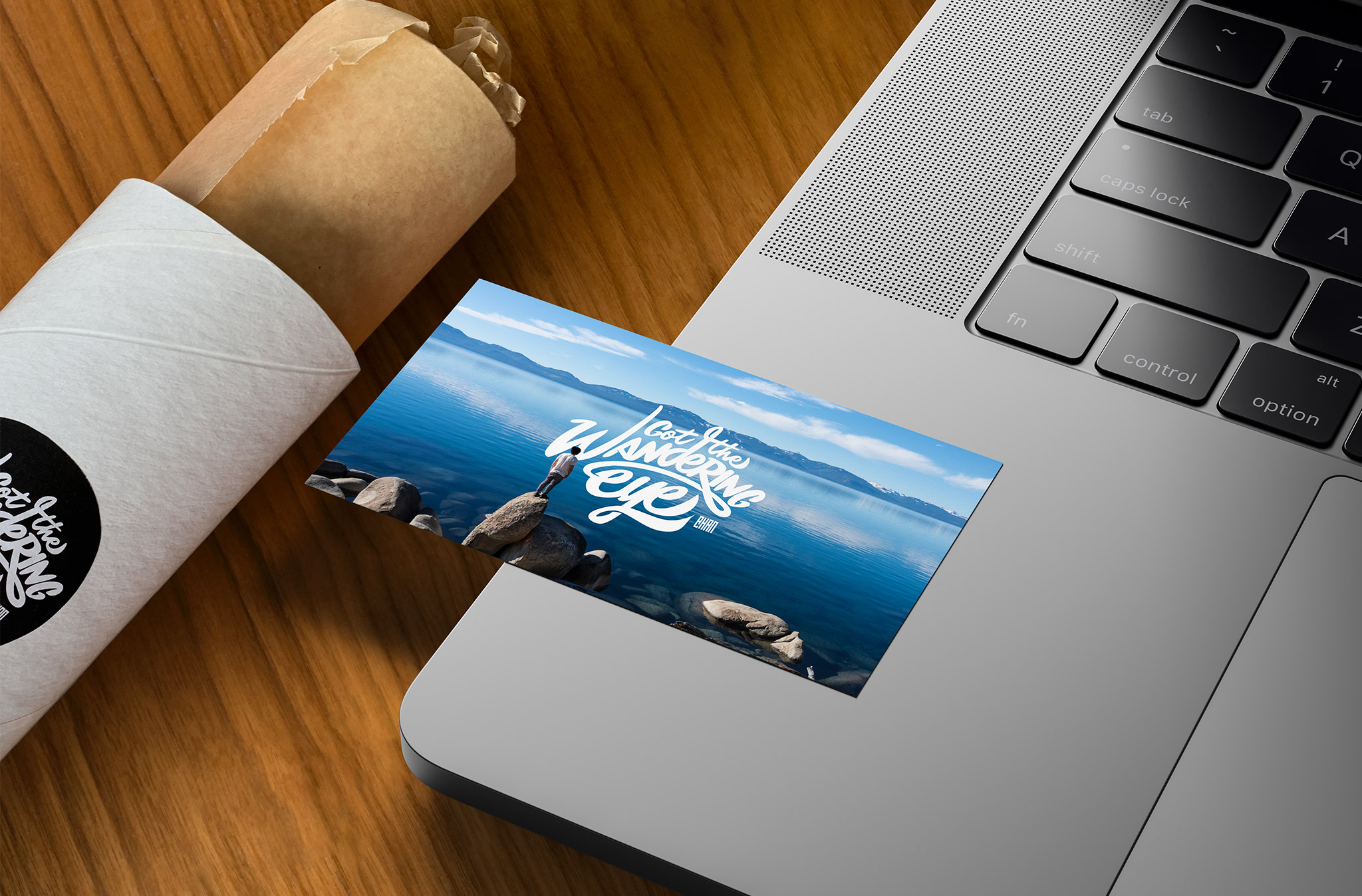
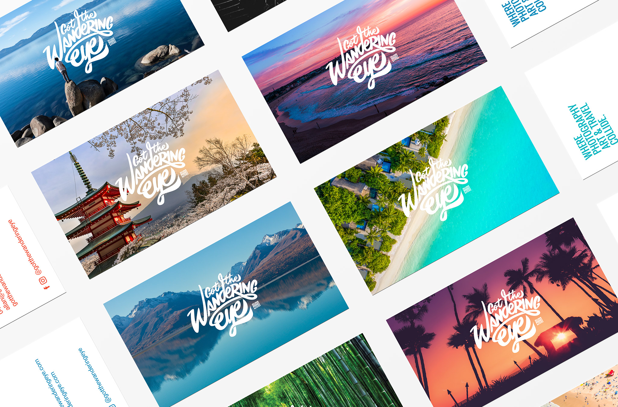
This concept carrying over to the visual representation of ever-changing imagery in the business cards showcases the variety of locations that I photograph on my travels, keeping the brand fresh and unique.
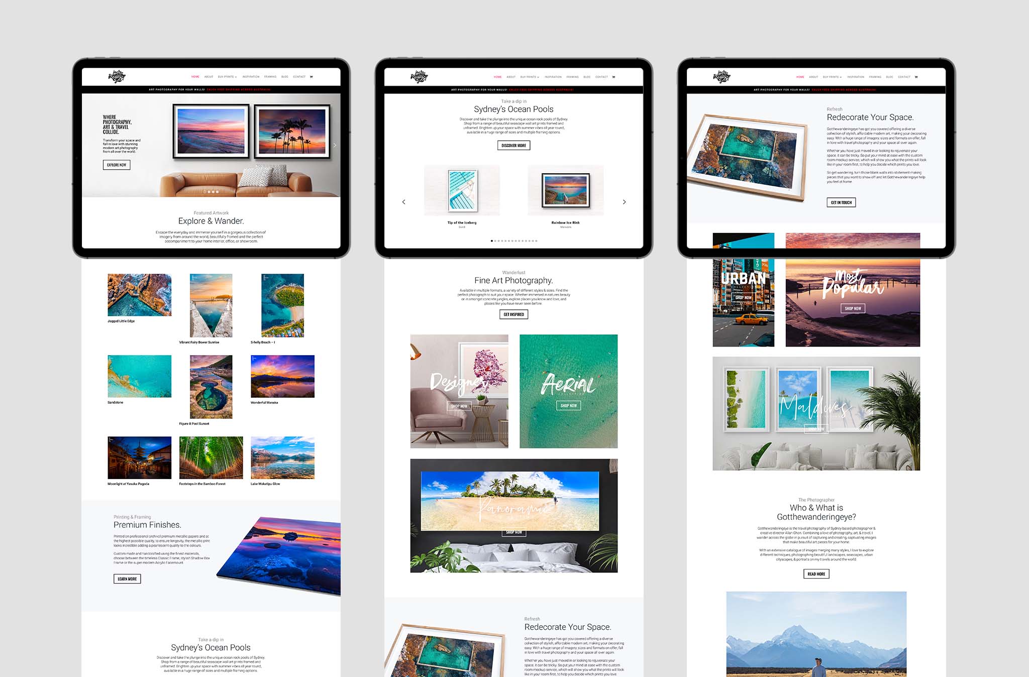
The dynamic, customised, bespoke, clean, modern, responsive website showcases the extensive online gallery of fine art. Allowing customers to make their purchases from the selection of coastal, aerial, travel, landscape, and portrait photography.
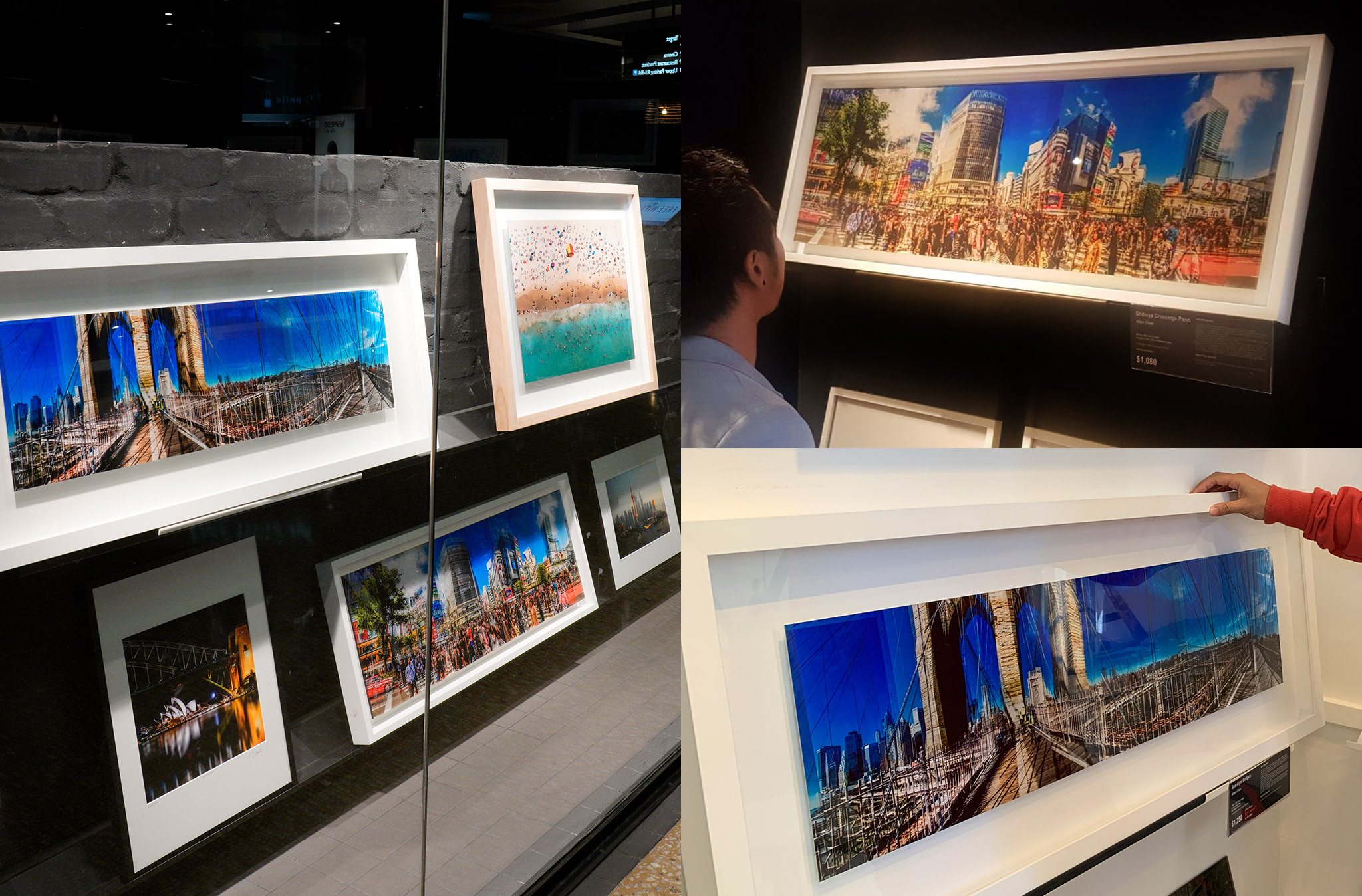
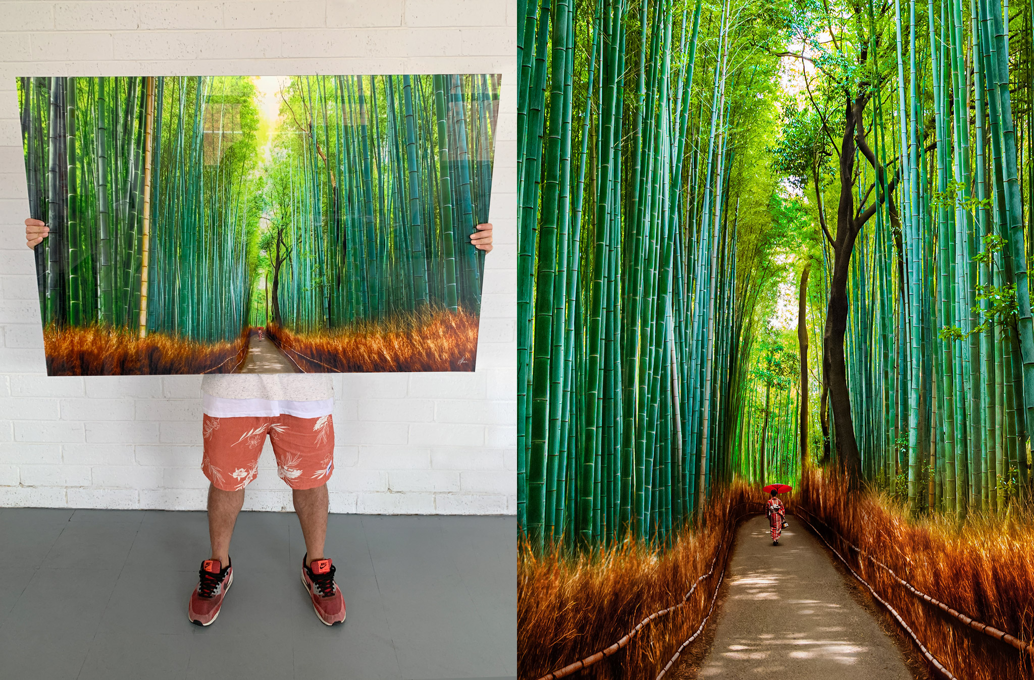
My gallery offers prints on the acrylic facemount finish, which is ideal for large feature wall art pieces. The most sought after and premium finish, it is the most modern, sophisticated and stunning way to showcase an image. The colours are sharper, more brilliant, intense and vibrant, giving the image a whole new dimension, creating a near 3D visual effect.
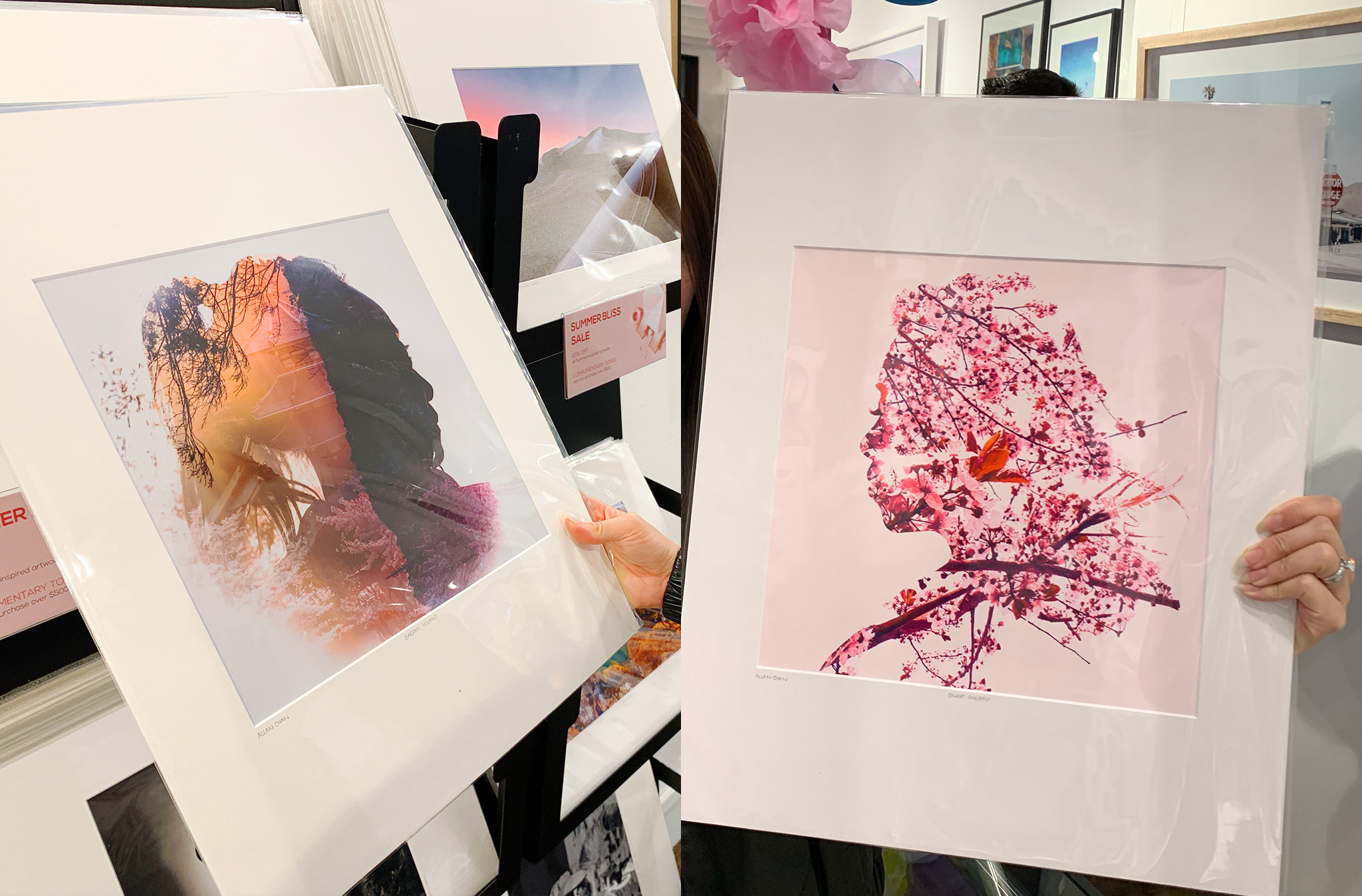
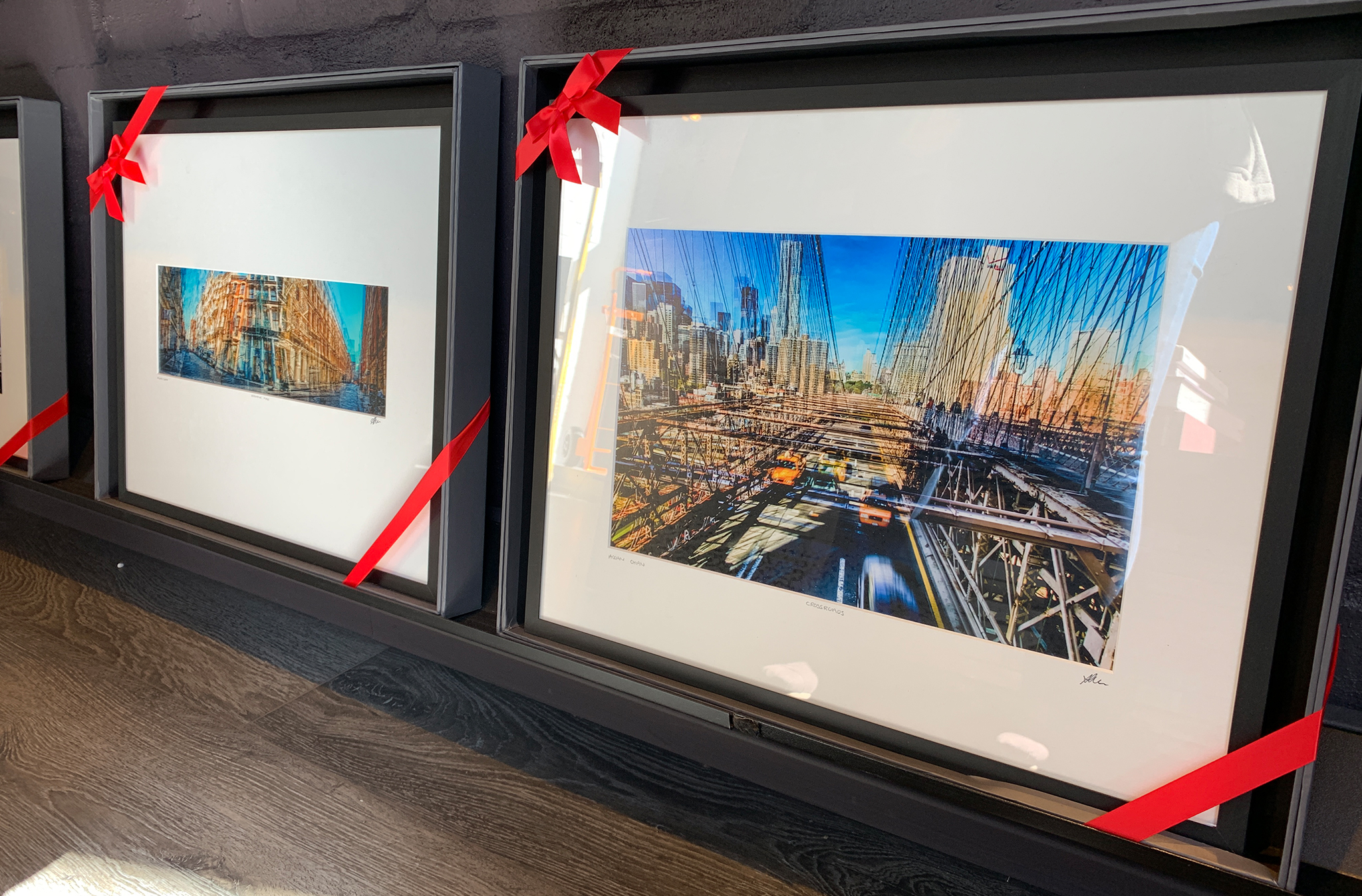
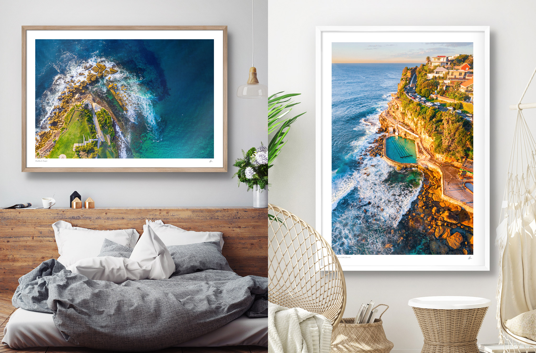
Perfect for complimenting the beachy home interior, the vast array of coastal images are available multiple framing options, the simplest most elegant way to display an image is the classic frame. Timeless, clean and beautiful. The image is isolated behind an acid-free mat board window, which is pushed up to the front of the shatterproof perspex.
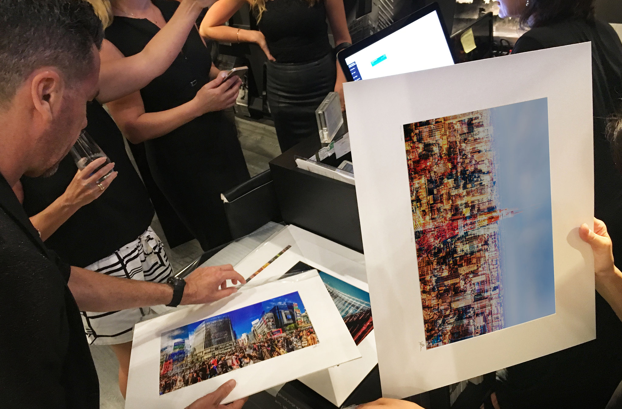
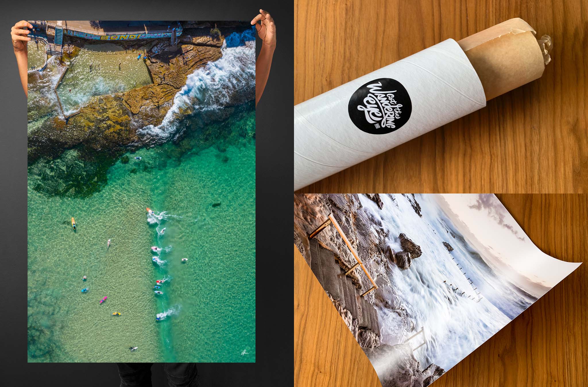
Meticulous detail goes into all my photographs. Printed on professional premium archival metallic paper, which has a silvery pearl-like finish, it enhances the highlights and midtones of the prints. The metallic print looks incredible adding a pearlescent quality to the colours and making the images pop.
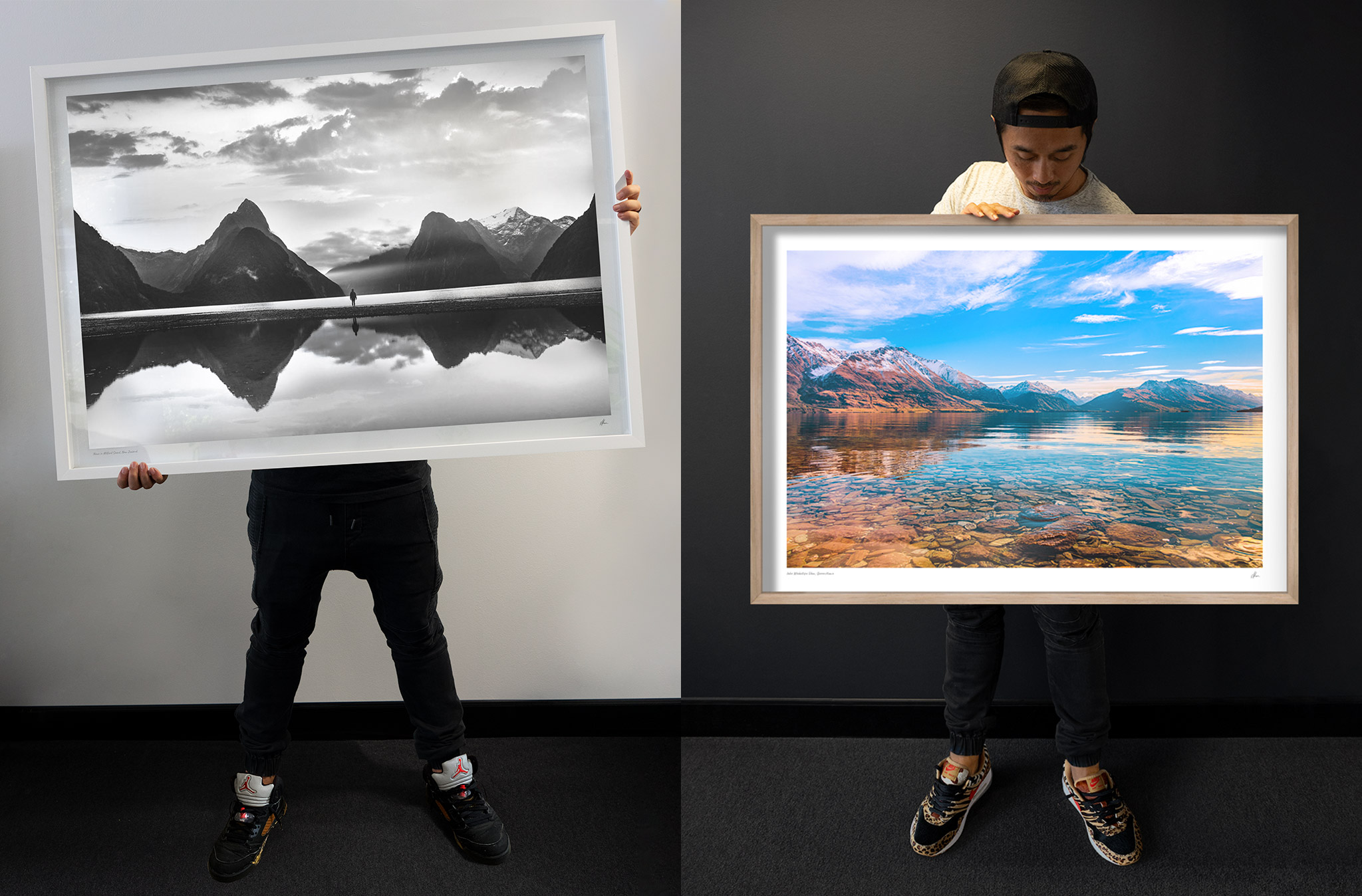
Stunning, picture-perfect, postcard landscapes, look phenomenal in the modern shadow box frame, which makes a bigger statement, consisting of a bolder, thicker, deeper frame and clean white internal lining.
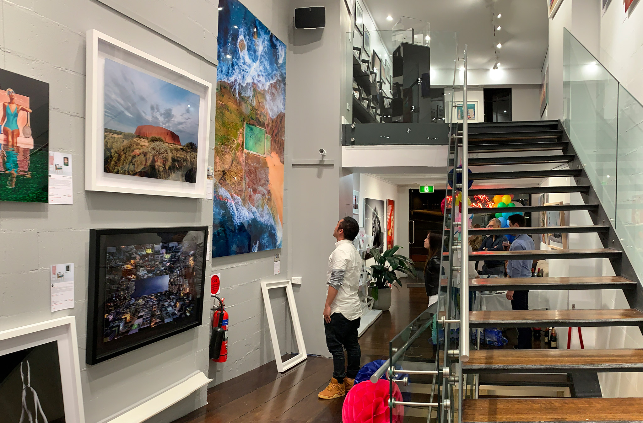
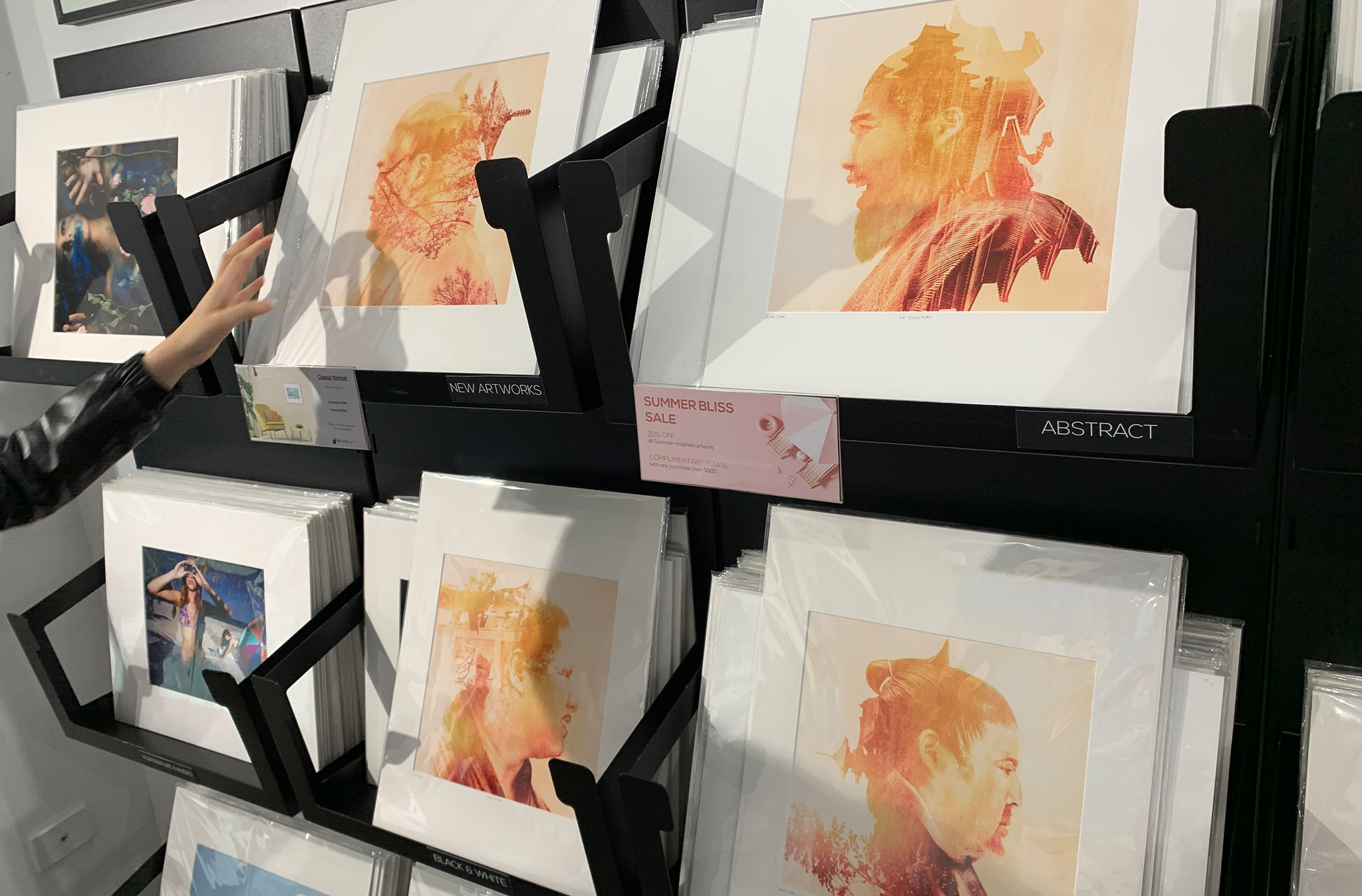
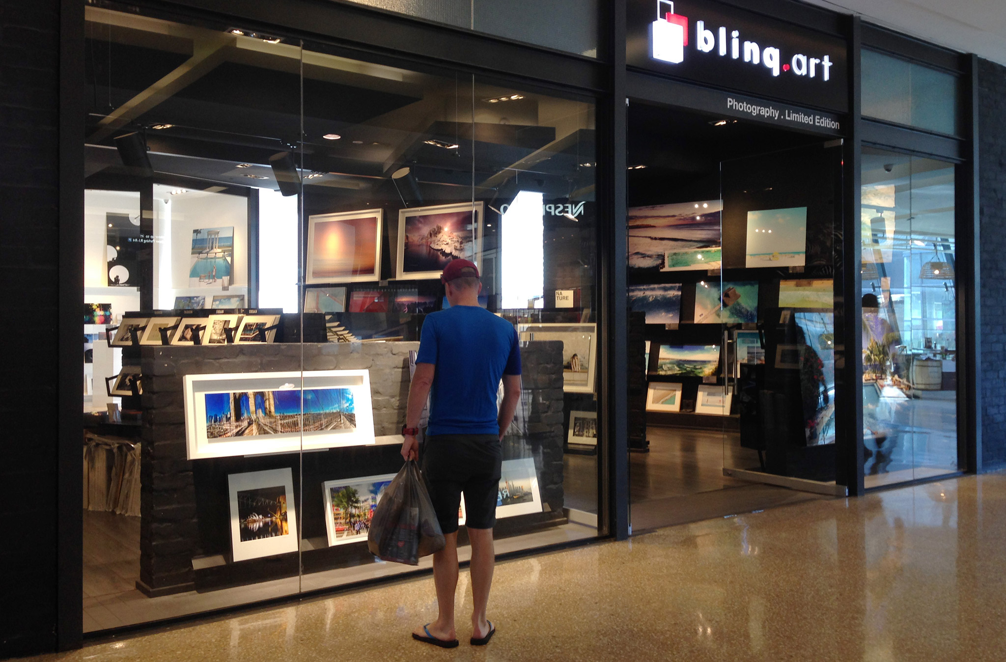
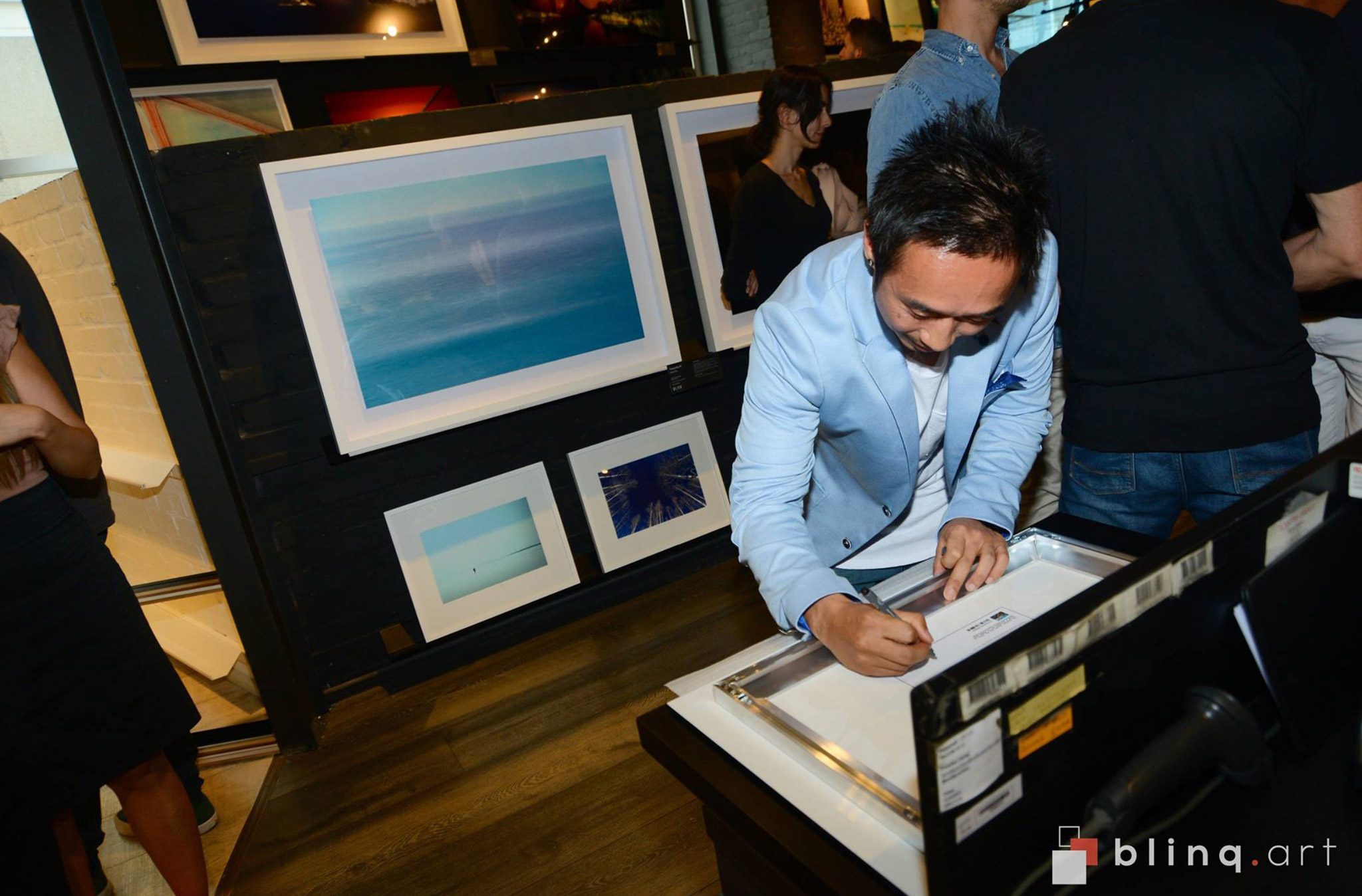
Hanging proudly in homes and offices around the world, my art is also featured in the blinq.art gallery. Formerly known as YellowKorner Australia, my collections have been on display in the Westfield Bondi Junction gallery and the Oxford Street Paddington gallery.
Showcasing my ‘Layers in the City’ + ‘Art of Japan’ + ‘Aerial Oceanscapes’ Collections. Gallery highlights include the gorgeous, larger than life 225x150cm acrylic print of Hey Mona, and the Art of the Sumo series.
